Today, we are thrilled to share the latest User Interface (UI) updates that we are going to release, all aimed at enhancing your experience on the Cevinio platform. These changes make working with our solution easier, faster, and more efficient.
Our dedicated team has invested significant effort into implementing these improvements for you, and we can’t wait to show you what’s new. Are you ready?
How to get the new look?
Do you remember? Not long ago, we implemented a new header menu design, which marked just the beginning of a larger initiative to enhance the User Experience (UX) on our platform. We recognize the crucial role UX plays and are committed to ensuring our users can fully enjoy the benefits of a premium design.
In that direction, we have now released additional upgrades designed to provide you with a modern and fresh user interface. In the following video, we will demonstrate how to access these new UI elements.
What’s brand new?
We made numerous great changes, starting with how the different elements in our platform look. Discover the new improvements below.
- Colors: Introduction of our new branded color palette. The main colors are Cevinio Indigo, Kobalt, and Teal. These colors make our platform look pleasant and vibrant at the same time.
- New icons: Icons are a powerful and fast communication tool. Have you seen the new icons we use? They’re already present in some modules, and now we’re adding them in more places to benefit from their power.
- New Font: Alongside the new UI, we’re introducing a modern font, OpenSans, available in different weights, to clearly distinguish titles, links, and regular text.
- Card Look: We’ve implemented a new way to show you information and actions related to one subject in one place.
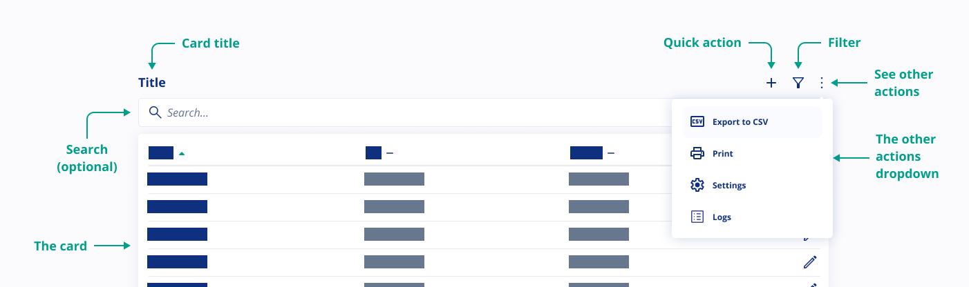
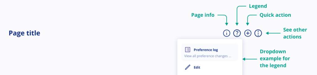
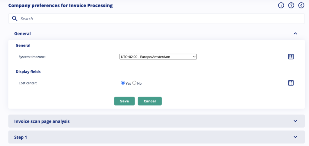
- New page header design: Now each page header contains a title and various icons representing different functions. Let’s explore what each of these icons mean:
- (i)-icon = Page information icon
In our retro styling (previous UX) you may have noticed a blue box with explanations at the top of almost every page. To free up space for essential information, we’ve relocated this to the information icon. Click on it to access additional page details.
- (?)-icon = Legend icon
What do the icons on this page represent? Click on the legend icon to get an explanation of what the icons on the page where you are mean. By clicking the legend itself, you can find additional information to help you understand these icons. The purpose is to help users understand the icons they see on every page.
- (<)-icon = Back to previous page icon
This icon will take you back to the previous page.
- (+)-icon = Quick action icon
By clicking on the ‘Quick Action’ icon, you can create a new item. For example, on the ‘Manage User’ page, clicking it lets you create a new user.
- (…)-icon = Other actions icon
Here, you’ll find various other actions that can be performed on the page, such as printing, downloading, or exporting.
- (i)-icon = Page information icon
- Center Alignment: With the new design, all text will be centered.
Dashboard
The dashboard will feature Cevinio’s new branded colors for a consistent experience.
Preferences
If you’re an admin, we’ve organized the company and user settings for you. Now, there’s a search bar to make finding specific settings even easier. This feature is only available in the modern style.
Where Can I See These Changes?
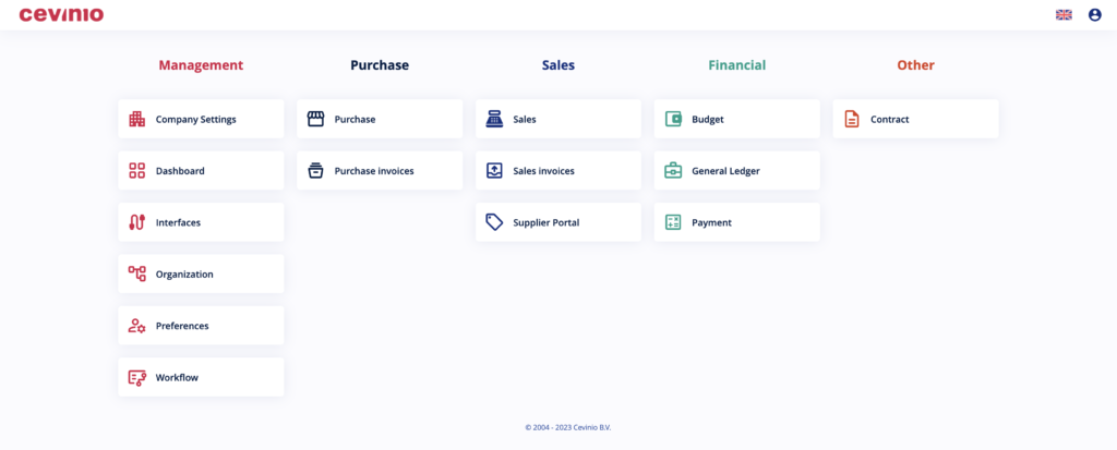
To see these changes, first, switch the look to “Modern,” like we show in the video below. You’ll notice the new look in these parts of our platform:
- Dashboard
- Company Settings
- Preferences
- Workflow
- Purchase
- General Ledger
- Payment
Changes in Retro styling
If you decide to keep using the retro, please be aware we have improved some design aspects there as well. Now, it also features the new icons, a different background color, updated link colors and a modern font. It keeps the retro look and feel, but with visually appealing experience.
What other changes can I expect?
In the next few weeks, we will continue to enhance the appearance of our platform. We’ll be updating the design of forms, text boxes, buttons, and even the login screen. Plus, you can expect more pages to feature this fresh new look!
Would you like to be among the first to learn about these changes and how to start benefiting from them? Please sign up here.